The Masterclass of Rich Dad: A Deep Dive into Premium Ice Cream Packaging Design
In the
modern retail landscape, a product’s success is often decided in the three
seconds it takes a consumer to scan a shelf. When we look at the frozen dessert
category, the stakes are even higher. Today, we are conducting a comprehensive
analysis of the Product packaging design for Rich Dad, specifically their
"Sipup" line. This is not just about a cold treat; it is a strategic
execution of sipup Branding that sets a new benchmark for ice cream packaging
design in 2026.
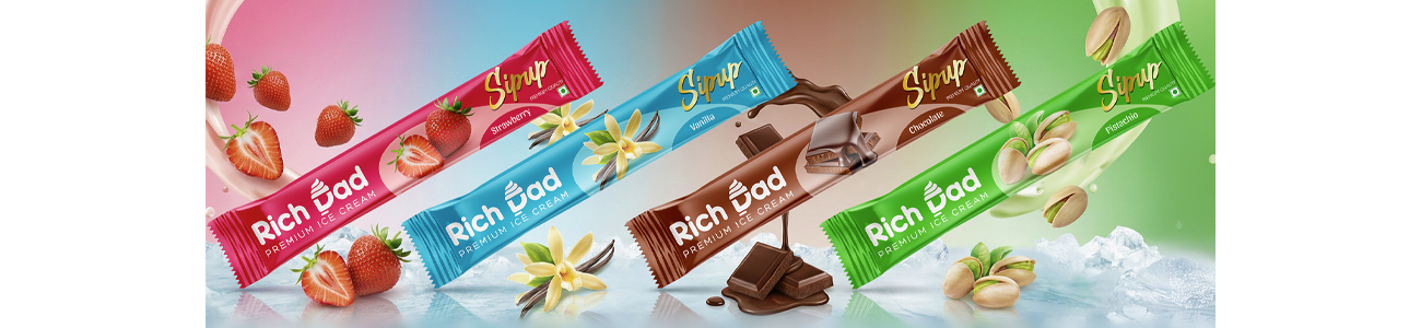
By
examining the four flavour variants Vanilla, Chocolate, Pistachio, and
Strawberry we can see how a cohesive ice candy pouch Packaging design can
elevate a brand from a local snack to a premium household name.
The Psychology of the First Impression
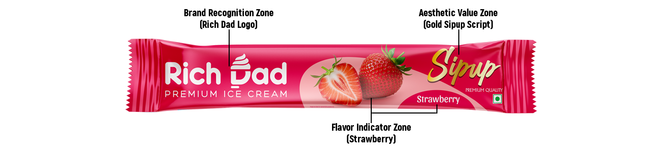
Every
successful Product packaging design begins with a clear brand hierarchy. Rich
Dad utilizes a "Source of Truth" approach in its visual assets,
ensuring that the logo and the product form are the stars of the show. The
sipup Branding is instantly recognizable thanks to its elegant gold script,
which provides a high-contrast "pop" against the vibrant background colours.
In the
world of ice cream packaging design, we often see cluttered layouts, but Rich
Dad opts for a minimalist aesthetic. This specific ice candy pouch Packaging
design uses a horizontal flow that guides the eye from the brand name on the
left to the flavour profile on the right. It is a masterclass in Product
packaging design because it doesn't try to over-explain; it lets the imagery do
the heavy lifting.
Analysing the "Sipup" Visual Identity
The core
of the sipup Branding lies in its typography. While "Rich Dad" is
rendered in a sturdy, modern sans-serif, "Sipup" uses a fluid,
handwritten style. This contrast is vital for effective Product packaging
design. The script font suggests a "personal touch" or a
"hand-crafted" recipe, which is a key pillar in premium ice cream
packaging design.
Furthermore,
this ice candy pouch Packaging design incorporates a unique ice cream swirl
icon within the letter 'D' of "Dad." This subtle bit of sipup
Branding ensures that even if the text were removed, the consumer would still
associate the shape with frozen dairy. This level of detail is what separates
average Product packaging design from industry-leading work.
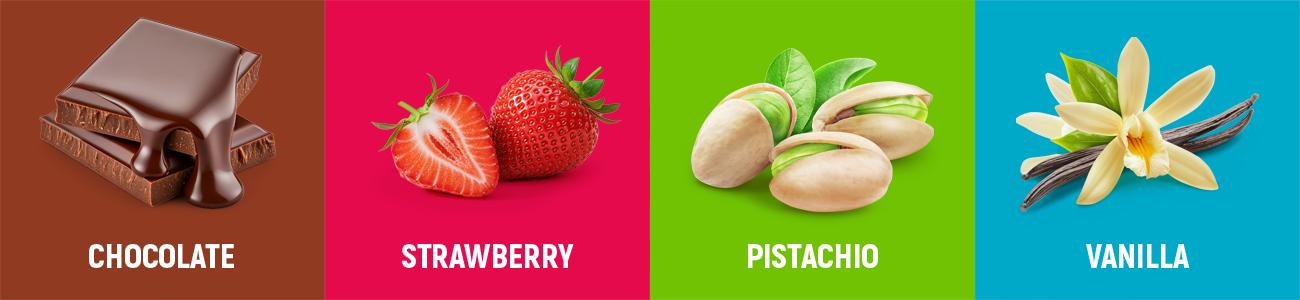
Flavour-First:
The Colour Palette Strategy
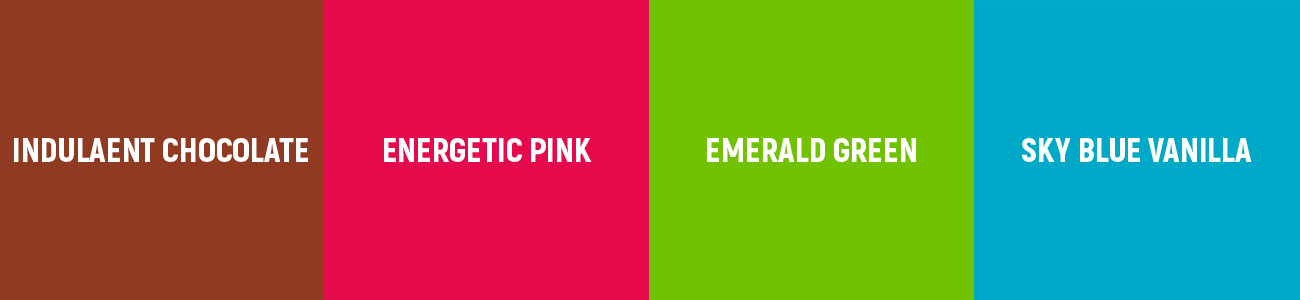
Let's look at the colour choices
that define this ice cream packaging design.
Vanilla: The use of a vibrant sky blue is
a bold choice for a Product packaging design focused on vanilla. Usually,
designers opt for cream or white. However, in an ice candy pouch Packaging
design, blue signals "ice-cold refreshment," which is a brilliant
move for sipup Branding.
- Chocolate: The deep, indulgent brown
used here is the gold standard for ice cream packaging design. The
gradient transitions from a dark mocha to a milky tan, reinforcing the
premium nature of the Product packaging design.
- Pistachio: The emerald green is fresh
and natural. This ice candy pouch Packaging design captures the essence of
the nut, ensuring the sipup Branding feels organic and high-quality.
- Strawberry: The energetic pink is a
classic staple of ice cream packaging design, but here it is elevated with
a subtle glow that highlights the "Hero" strawberry image. This
is Product packaging design at its most appetizing.
The "Hero Image" and Appetite Appeal
In any ice candy pouch Packaging design, the "Hero Image" (the ingredient shot) must look good enough to eat. Rich Dad’s Product packaging design features hyper-realistic renders of vanilla orchids, chocolate blocks, pistachios, and fresh strawberries.
The way
these images are integrated into the ice cream packaging design is seamless.
Notice the "halo" effect around the ingredients; this is a signature
element of the sipup Branding. It creates a focal point that draws the
consumer's gaze directly to the flavour source. When you compare this to other
ice candy pouch Packaging design examples on the market, the clarity and
lighting of the Rich Dad assets stand out as superior Product packaging design.
Engineering the Pouch: Form Meets Function
An ice
candy pouch Packaging design has different physical requirements than a tub or
a carton. It needs to look good even when the plastic is slightly crinkled or
frozen. The Product packaging design for Rich Dad accounts for this by placing
the most critical elements the sipup Branding and the flavour name in the
"safe zones" of the layout.
This
strategic placement ensures that the ice cream packaging design remains legible
even under a layer of frost. The metallic sheen suggested in the mockups adds a
layer of "lux-utility" to the ice candy pouch Packaging design. This
is a critical component of modern Product packaging design: the material must
feel as premium as the graphics look.
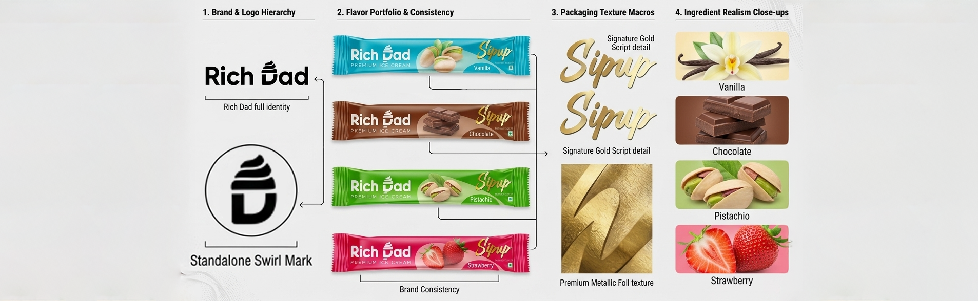
Consistency is Key for sipup Branding
One of
the hardest things to achieve in ice cream packaging design is across-the-board
consistency. If you look at all four images, the "Rich Dad" logo, the
"Sipup" script, and the "Premium Quality" badge are in the
exact same coordinates. This consistency is the backbone of the sipup Branding.
When a
customer sees the green pouch, they already know the quality level because
they’ve tried the blue one. This "familial" approach to Product
packaging design builds massive brand equity. Every ice candy pouch Packaging
design in the series acts as an advertisement for the others. This is why ice
cream packaging design is so much more than just drawing a pretty picture; it’s
about building a visual system.
The Role of Typography in Premium Positioning
Let's
talk about the smaller details in this Product packaging design. The words
"Premium Ice Cream" and "Premium Quality" are set in a
clean, uppercase font with wide kerning (letter spacing). In the world of ice
cream packaging design, wide kerning is a shorthand for "luxury."
This
typographic choice supports the sipup Branding by making the product feel more
expensive than a standard ice pop. Even in a simple ice candy pouch Packaging
design, these small "luxury cues" make a huge difference in how the
consumer perceives the value of the Product packaging design. Rich Dad has
successfully used ice cream packaging design to position itself as an elite
choice.
Market Competitiveness and sipup Branding
The
frozen treat aisle is a battlefield. To win, your Product packaging design must
be louder or more sophisticated than the competition. Rich Dad chooses
sophistication. The sipup Branding doesn't use clashing colours or
"discount" starbursts. Instead, it relies on a clean, high-fidelity
ice candy pouch Packaging design that respects the consumer's intelligence.
This
approach to ice cream packaging design is particularly effective for 2026
trends, where "clean labels" and "minimalist aesthetics"
dominate the Product packaging design space. By sticking to the core elements
of the sipup Branding, Rich Dad creates a timeless look that won't feel dated
in a few months.
Breaking Down the Four Variants
The Vanilla Masterpiece
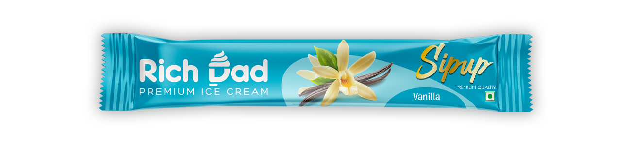
In this
ice cream packaging design, the vanilla flower is presented with such detail
that you can almost smell the pod. The sipup Branding is placed over a soft
wave pattern, which adds a sense of movement to the ice candy pouch Packaging
design. It’s a perfect example of balanced Product packaging design.
The Chocolate Indulgence
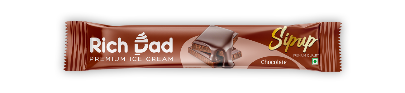
The
chocolate variant is perhaps the strongest ice candy pouch Packaging design in
the lineup. The melting chocolate drip is a classic "thirst-trap" for
the eyes. By keeping the sipup Branding in gold, it complements the warm tones
of the chocolate, making this a standout piece of ice cream packaging design.
The Pistachio Freshness
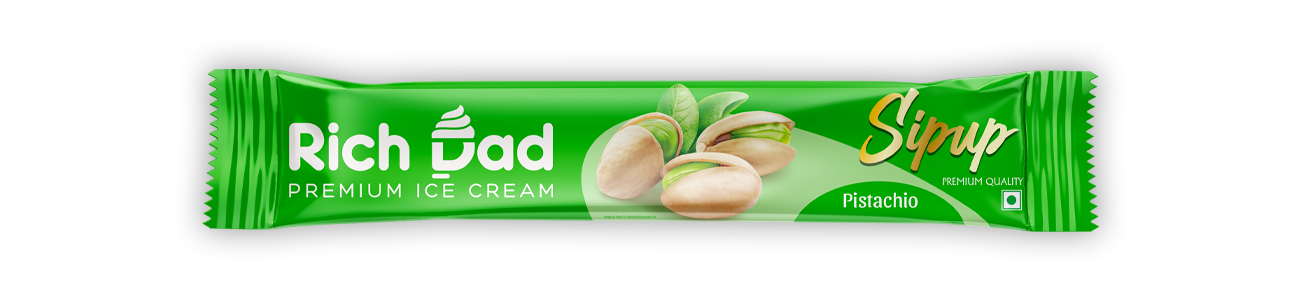
Green is
a tricky colour in Product packaging design, but Rich Dad nails it. The
pistachio image is crisp and vibrant, ensuring that the sipup Branding feels
healthy and premium. This ice cream packaging design is likely to attract a
more mature demographic looking for sophisticated flavours.
The Strawberry Energy
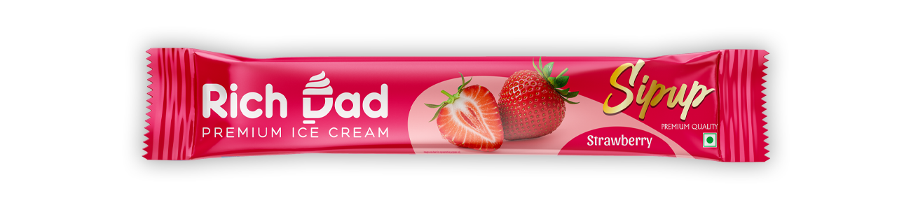
The
strawberry variant is the "pop" of the group. Its bright magenta hue
is a cornerstone of effective ice candy pouch Packaging design. Even with such
a loud colour, the sipup Branding remains the primary focus, proving that good
Product packaging design can handle bold palettes without losing its identity.
Technical Specifications for Packaging Success
If we
look at the technical side of this ice cream packaging design, the use of
"Safe Zones" and "Bleeds" is evident. The Product packaging
design ensures that the serrated edges of the ice candy pouch Packaging design
do not cut through the logo or the sipup Branding.
Many
brands fail because their ice cream packaging design looks good on a screen but
bad in production. Rich Dad has clearly optimized their Product packaging
design for the reality of high-speed manufacturing. This attention to detail in
the ice candy pouch Packaging design phase is what makes the sipup Branding so
resilient.
The Impact of Digital-First Design
In 2026,
Product packaging design must be "Instagrammable." The Rich Dad line
is perfect for social media. The high contrast of the sipup Branding makes it
easily readable on a small phone screen. This is a crucial evolution in ice
cream packaging design.
An ice
candy pouch Packaging design that looks good in a hand-held "selfie"
is worth more than a thousand billboards. This digital-friendly Product
packaging design ensures that the sipup Branding spreads organically through
user-generated content. This is the ultimate goal of modern ice cream packaging
design.
Conclusion: The Future of Rich Dad
The
journey through Rich Dad’s Product packaging design reveals a brand that
understands its audience. Through consistent sipup Branding, a bold yet refined
ice cream packaging design, and a functional ice candy pouch Packaging design,
they have created something truly special.
This
Product packaging design doesn't just hold ice cream; it holds the brand's
reputation. Every time a consumer picks up an ice candy pouch Packaging design
with that gold sipup Branding, they are engaging with a piece of art. As we
look at the future of ice cream packaging design, Rich Dad will undoubtedly be
a reference point for designers looking to master the art of Product packaging
design.