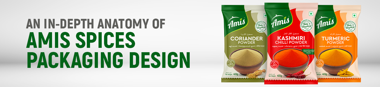
Spice It Up: An In-Depth Anatomy of Amis Spices’ Stand-Out Packaging Design
The world
of Product packaging design is often a loud, cluttered space, especially in the
food industry. When you walk down the grocery aisle, you are hit with a sensory
overload. However, once in a while, a brand like Amis comes along and masters
the art of Spices & Masala Branding so effectively that you can’t help but
stop. This blog post offers a comprehensive analysis of how Amis has perfected
their Spices Pouch packaging design and Masala Powder Packaging design to
dominate the kitchen shelf.
Un-spicing the Brand: A Deep-Dive into Amis Spices
Packaging Design
Introduction: The Art of First
Impressions in Product packaging design
The
average spice aisle is a battleground where Product packaging design acts as
the primary weapon. Research shows consumers decide in seconds, meaning your Spices
Pouch packaging design needs to speak volumes without saying a word. Amis
understands that effective Spices & Masala Branding isn't just about a
logo; it’s about creating an emotional bridge to the consumer.
When we
look at their Masala Powder Packaging design, we see a strategic blend of
heritage and modern aesthetics. Each pouch is a testament to how Product
packaging design can influence flavour perception before the bag is even
opened. In the following sections, we will deconstruct how their Spices Pouch
packaging design creates a cohesive narrative and why their Masala Powder
Packaging design is a benchmark for the industry.
Brand
Identity: The Core of Spices & Masala Branding
At the
heart of any successful Product packaging design is a clear identity. The Amis
logo is the anchor of their Spices & Masala Branding strategy. By choosing
a clean, minimalist font with a leaf motif, they’ve elevated their Spices Pouch
packaging design to look premium yet accessible.
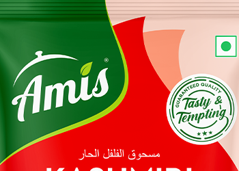
A
critical element of their Masala Powder Packaging design is the "Tasty
& Tempting" seal. This trust mark is a staple in high-quality Product
packaging design, providing instant reassurance. When you analyse their Spices
& Masala Branding, you notice that the brand doesn't try to hide behind
complex patterns. Instead, the Spices Pouch packaging design relies on white
space and bold typography. This clarity is what makes their Masala Powder
Packaging design so effective in a crowded market.
The Psychology of Colour in Masala Powder Packaging design
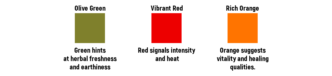
In the
realm of Product packaging design, colour is never an accident. Amis uses colour
to define their Spices & Masala Branding through a spectrum of heat and
health.
- The Power of Red: For their Kashmiri Chilli,
the Masala Powder Packaging design uses a vibrant red. This is a classic
move in Product packaging design to signal heat. The red in their Spices
Pouch packaging design triggers the appetite and sets expectations for a
spicy experience.
- The Earthiness of Green: Their Coriander Masala Powder Packaging design utilizes an olive green. In Spices & Masala Branding, green represents freshness. By integrating this into the Spices Pouch packaging design, they communicate the herbal nature of the product.
- The Glow of Yellow: Turmeric is the "gold" of Spices & Masala Branding. The yellow-orange hue in this Masala Powder Packaging design suggests purity and health benefits, a key pillar of modern Product packaging design.
By using
these distinct colours, the Spices Pouch packaging design allows for instant
product recognition. This is a hallmark of intelligent Product packaging design reducing
the cognitive load on the shopper. Their Spices & Masala Branding is
reinforced every time a customer easily grabs the right pouch, proving that a
well-thought-out Masala Powder Packaging design is functional as well as
beautiful.
Global
Clarity: Multilingual Spices Pouch packaging design
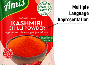
One of
the most impressive feats of the Amis Product packaging design is its
multilingual approach. In a globalized market, Spices & Masala Branding
must speak many languages. Their Spices Pouch packaging design includes Arabic,
English, Hindi, and Malayalam, ensuring that their Masala Powder Packaging
design resonates with a diverse demographic.
This
inclusivity is a brilliant move for their Spices & Masala Branding. It
transforms a simple Spices Pouch packaging design into a global ambassador for
Indian flavours. When Product packaging design considers the language of the
consumer, it builds a deeper level of trust. This is why their Masala Powder
Packaging design feels personal to so many different people.
The Visual Rhetoric of Spices & Masala Branding
Visual
Realism in Product packaging design
The
photography used in the Amis Masala Powder Packaging design is where the
"magic" happens. Most Product packaging design uses stock photos, but
Amis has invested in high-quality, bespoke imagery for their Spices Pouch
packaging design.
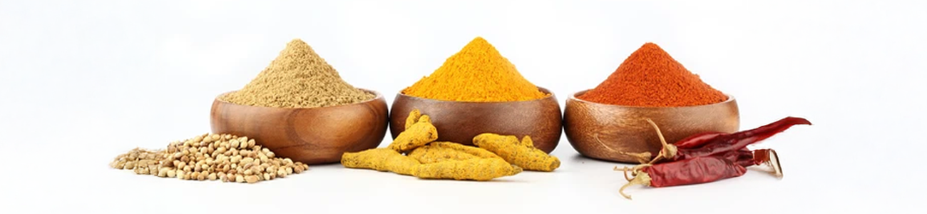
The
"Source of Truth" in their Spices & Masala Branding is the
depiction of the raw ingredients next to the bowl of powder. This visual
technique in Masala Powder Packaging design creates a sense of authenticity. It
tells the consumer exactly what they are getting. In Product packaging design,
this is called "sensory promise." By showing the whole chilli or the
turmeric root on the Spices Pouch packaging design, they reinforce the premium
nature of their Spices & Masala Branding.
Functional
Layout: The Backbone of Spices Pouch packaging design
A common
mistake in Masala Powder Packaging design is trying to cram too much
information on the front. Amis avoids this by using a standardized layout in
their Product packaging design. This consistency is vital for long-term Spices
& Masala Branding success.
Whether
it’s the Chilli or the Turmeric, the Spices Pouch packaging design follows the
same hierarchy:
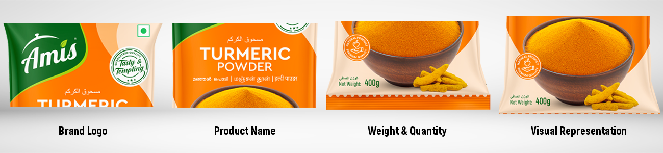
1. Brand Logo (Spices & Masala
Branding)
2. Product Name (Masala Powder
Packaging design focus)
3. Weight and Quantity (Product
packaging design utility)
4. Visual Representation (Spices
Pouch packaging design aesthetics)
This
repetition across their entire range strengthens their Spices & Masala
Branding. When a customer sees the familiar layout of an Amis Spices Pouch
packaging design, they already know it’s a quality product. This is how great Product
packaging design builds loyalty.
Shelf
Impact: Standing Out with Masala Powder Packaging design
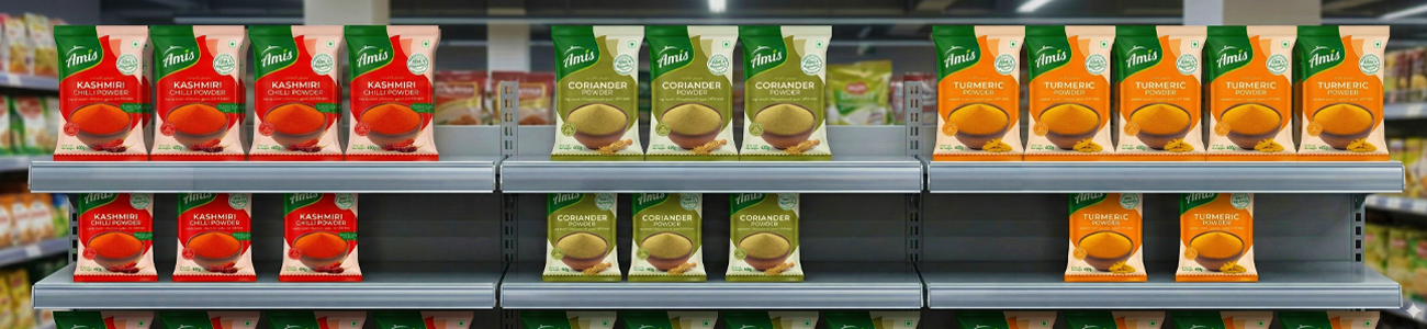
When
these pouches are lined up, the power of their Product packaging design becomes
even more apparent. The Spices & Masala Branding is cohesive across the
board. The uniform shape of the Spices Pouch packaging design creates a
"brand block" on the shelf, which is a key goal in retail-focused Product
packaging design.
Their Masala
Powder Packaging design doesn't just look good in a mockup; it looks great in
real-world lighting. This is the ultimate test for any Spices Pouch packaging
design. By focusing on high-contrast colours and clear typography, their Spices
& Masala Branding remains legible even from a distance.
Conclusion:
The Future of Product packaging design and Spices & Masala Branding
Amis
Spices has set a high bar for Masala Powder Packaging design. Their ability to
balance cultural tradition with modern Product packaging design principles is
what makes their Spices & Masala Branding so effective. Every element of
their Spices Pouch packaging design, from the choice of colours to the
multilingual text, serves a specific purpose.
In the
world of Product packaging design, details matter. The Amis Spices Pouch
packaging design isn't just a container; it’s a communication tool. Their Masala
Powder Packaging design invites the cook into a world of flavour, while their Spices
& Masala Branding ensures they stay there. As we continue to see evolution
in Product packaging design, Amis will undoubtedly remain a leader in the Spices
Pouch packaging design space, proving that a well-executed Masala Powder
Packaging design is the secret ingredient to market success.
Ultimately,
the success of their Spices & Masala Branding lies in its honesty. Their Spices
Pouch packaging design promises quality, and their Masala Powder Packaging
design delivers it. This is the pinnacle of what Product packaging design
should strive for.