Maximus: A Masterclass in Frozen Food Packaging Design and Brand Strategy
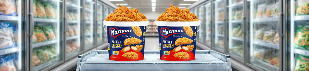
In the high-stakes environment of the
retail frozen food aisle, packaging is much more than a protective vessel; it
is the "silent salesman". When a consumer stands before the freezer
case, the frozen food packaging design must work instantly to capture attention
amidst a sea of competing brands. This is especially true for the Maximus
Frozen Fried Chicken Bucket, where the fried chicken packaging design must
balance the convenience of a frozen product with the sensory expectations of a
restaurant-quality meal. To succeed, a product packaging design must synergize
various elements to create a premium, trustworthy, and appetite-inducing brand
presence. For Maximus, this means utilizing instant food branding to transform
a simple frozen item into a "3-minute delight".
The Psychology of Color
One of the most striking aspects of the
Maximus strategy is its sophisticated use of color psychology within its frozen
food packaging design. While many competitors in the sector lean on a single
primary color, Maximus utilizes a tri-color palette that serves distinct
psychological purposes.
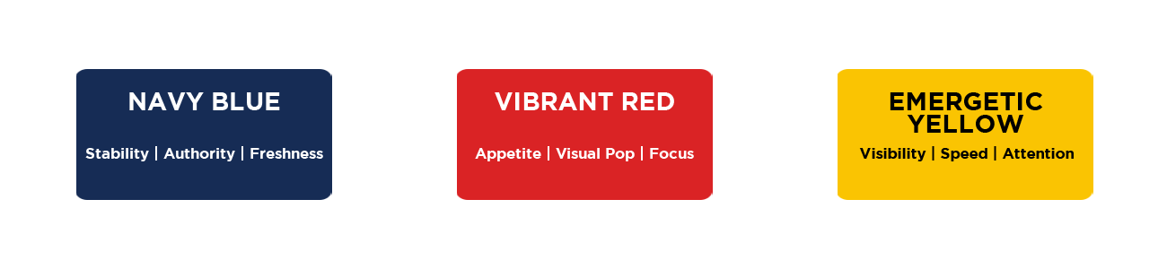
- Deep Navy Blue: This is the
dominant background color in the frozen food packaging design. It
signifies coldness and preservation, reassuring the customer that the
product is maintained at peak freshness. These blue grounds the product
packaging design in a sense of stability, authority, and premium quality.
- Vibrant Red: Contrast is key in
fried chicken packaging design. Maximus uses a bright red accent in its
logo's heart-shaped frame and the base "swoosh" to create a
visual "pop". Red is scientifically proven to stimulate appetite
and increase heart rate, making it a critical component of successful
fried chicken packaging design.
- Energetic Yellow: The use of
energetic yellow for critical information like "BUCKET CHICKEN"
and the "3 Minute Delight" badge is a vital consideration for
product packaging design. Yellow is the most visible color in the spectrum
under the low-light conditions common in freezer cases. This color choice
is a hallmark of effective instant food branding, conveying cheerfulness
and speed.
Visual Hierarchy and Consumer Journey
A successful brand identity relies on a
clear information hierarchy. In the realm of instant food branding, Maximus
manages this by directing the viewer's eye through a strategic
"F-pattern" of scanning.

- The Brand: The "Maximus"
logo sits at the top left, ensuring the brand is the first-place Western
readers look. This heart-shaped enclosure is a central element of their
product packaging design, suggesting a product made with care and passion.
- The Product: The center of the
bucket is reserved for high-resolution product photography, a core pillar
of fried chicken packaging design. This visual proof of quality is what
drives the purchase in frozen food packaging design.
- The Benefit: The instant food
branding is reinforced by placing the "3 Minute Delight" badge
and a QR code in the lower quadrants, answering practical consumer
questions about preparation time and modern engagement.
Appetite Appeal and Transparency
In the world of FMCG branding,
"appetite appeal" is the most critical metric for any product
packaging design. The Maximus fried chicken packaging design utilizes a
technique known as "overflowing abundance". By depicting a literal
mountain of golden-brown chicken strips, the frozen food packaging design
suggests that the bucket is packed to the brim with value.
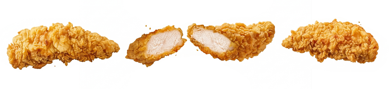
Crucially, the product packaging design
includes a cross-section image of a chicken strip. This is a brilliant move for
instant food branding transparency. By showing the thick, white, juicy breast
meat inside the crunchy exterior, the fried chicken packaging design overcomes
consumer fears that frozen chicken is "mystery meat". It visualizes
texture and quality, bridging the gap between a frozen product and a
fresh-from-the-fryer experience through clever frozen food packaging design.
The Strategy of Form
The choice of a bucket over a traditional
flat box is a strategic retail strategy in frozen food packaging design. The
bucket shape is synonymous with the "fried chicken experience"
pioneered by restaurant giants. By adopting this form factor, the Maximus fried
chicken packaging design subconsciously communicates a "sharing" size
perfect for family gatherings.
The inclusion of a handle adds a layer of
functional product packaging design. It implies ease of transport, while the
plastic material offers moisture resistance that cardboard boxes often lack in
condensation-heavy environments. This attention to physical utility is a key
differentiator in frozen food packaging design, reinforcing the instant food
branding promise of convenience.
Modern Hooks and Digital Engagement
Modern instant food branding must address
the primary pain point of the target audience: lack of time. The "3 Minute
Delight" icon is a high-impact callout within the product packaging design
that addresses this directly. In an era of air fryers, promising a
"delight" in just three minutes is a powerful conversion tool for any
frozen food packaging design.
Furthermore, the inclusion of a prominent
QR code on the side of the bucket bridges the gap between physical product
packaging design and digital engagement. This allows the instant food branding
to extend beyond the initial purchase, offering recipes, nutritional
deep-dives, or loyalty rewards. Such connectivity is becoming a standard
requirement for competitive fried chicken packaging design.
Conclusion: A Recipe for Success
The Maximus Frozen Fried Chicken Bucket is
a masterclass in product packaging design analysis. It doesn't just hold
chicken; it uses frozen food packaging design to communicate a story of trust,
quality, and extreme convenience. By mastering the balance between cool,
professional navy and warm, appetizing red, the brand stands out as a premium
contender.
Ultimately, thoughtful attention to detail
from the cross-section of a chicken strip to the psychological impact of a
heart-shaped logo makes all the difference in fried chicken packaging design.
Success in frozen food packaging design requires a deep understanding of
consumer behavior. As retail competition intensifies, Maximus demonstrates that
superior instant food branding and a well-executed product packaging design are
the keys to winning the consumer's heart and stomach.